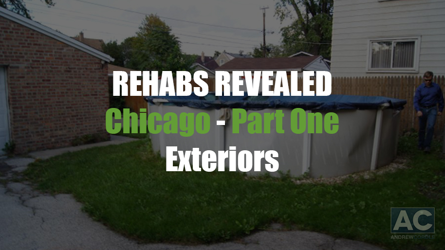
This is a new entry in my Rehabs Revealed series. Each Wednesday for the next 4 weeks I’ll highlight a different aspect of this rehab. It will demonstrate how my team does what they do so well and, hopefully, give you some ideas you can use in your business! In Part 1 this week, we’ll take a look at the outside. Scroll through the images as well as read a little about how we got started on the project below. Outside Improvement Strategy: This property is a classic Chicago two-story house with a partial brick exterior along with vinyl siding. Furthermore, the house was built in 1944, it also has a detached garage. The landscaping was a bit challenging on this house for two reasons. First, everything was overgrown. Secondly, there was a big hole in the backyard where a pool used to be. We had some dirt brought in to level out the back yard. You have to have the vision to see past the ugly things, whether they’re on the inside of the house or on the outside. Once the bushes were trimmed down and we added flowers and flower boxes, it really created a nice curb appeal. Although this house was only 1,178 square feet, it really turned out with a nice layout on the inside and a great curb appeal on the outside. Here are some of the SKU’s we used on the outside of the house: Material list (exterior): Base Paint – Garden Wall (Behr PP 730D-4) Trim Paint – Cornerstone (Behr PP 330E-2) Accent Paint – Intellectual Gray (Behr PP UL260-2) Front Door Paint – Roasted Pepper (Behr PP 180D-7) Door Handle – Kwikset Smartkey (745-825) Numbers – Hillman Group (844-043) Mailbox – Repainted existing In next Wednesday’s post, I’ll take you inside the house to show you where we started and what we did to transform from an old house to someone’s dream home. ...
Read More »

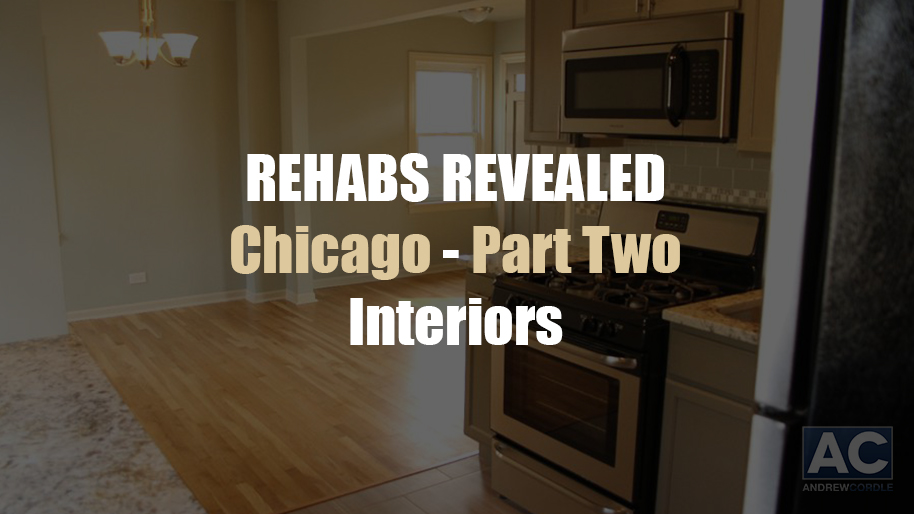
We almost always recommend placing a high-quality laminate flooring from Home Depot (many with a 50-year warranty) throughout the main level of a house. In the case of 3646 W. 87th Street in Chicago, Illinois, we were able to have the hardwood floors refinished beautifully. For a cheaper price than what laminate flooring would have cost. These gorgeous hardwood floors are probably one of the biggest “statement” pieces in this house. Both the glossy floors and the nice kitchen really pop as you enter the living room of this house. The layout of this house was pretty standard, so we primarily just opened up one wall between the living room and the dining room, but we pretty much left the walls upstairs in tact. The brushed nickel fixtures throughout this house and the cool paint scheme really transformed this house into a trendy Chicago abode. Here are some of the SKU’s we used on the inside of the house: Wall and Ceiling Color – Silver Sage (UL 210-8) Trim Color – Fledgling (MSL 198) Door Color – Elephant Skin (UL 260-5) Hardwoods – Solid Oak (Minwax Stain: Special Walnut with Semi-Gloss Poly) Carpet – Touchdown Caramel (528-529) Living Room Light – 13″ Brushed Nickel 2-Light Flushmount Twin-Pack (701-704) Dining Room Chandelier – 3-Light Brushed Nickel (118-638) Baseboards – Pro-Pack of 7/16″x3″x12′ (143-210) ...
Read More »

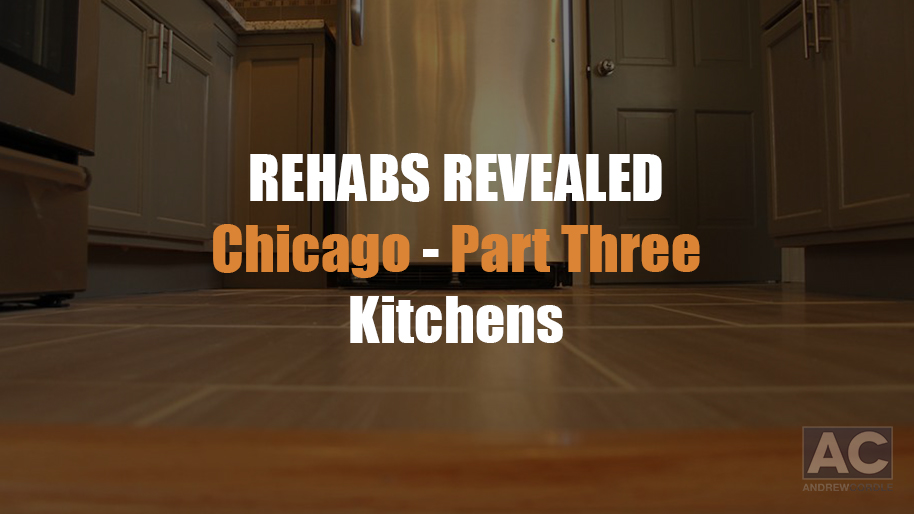
For the kitchen makeover, we wanted a larger “feeling” in the space. We accomplished this by keeping an open concept between the kitchen and dining room. The lighter kitchen cabinet color we used really gave a brighter and larger feeling to a smaller area. We also decided to go with a refrigerator that wasn’t so large that it overpowered the area. The kitchen is the first thing you see as you come around the corner from the living room, so we designed it with the granite counter tops and tile back splash to really make it pop! There wasn’t a lot that we could do differently with the kitchen layout due to the basement door being in the kitchen, but the glass accent tile and subway tile on the walls really diverted the attention to have a positive outcome. Here are some of the SKU’s we used in the kitchen: Floor Tile – Tahiti Gris 20″ x 20″ (Special Order – FCST6AC021) Floor Grout – Polyblend #382 Bone (123-852) Cabinets – Unfinished Oak Cabinets (387-246) Cabinet Color – Mushroom (MSL 248) Cabinet Handles – 3″ Bar Pull 4-Pack Stainless (731-837) Backsplash – Crackly Fantasy (773-887) with Daltile Architectural Gray 3″ x 6″ Subway Tile (special order) Backsplash Grout – Polyblend #382 Bone 10-lb. Non-Sanded Grout (123-851) Stove – Frigidaire 30-inch, 5.0-cubic feet with Self-Cleaning Convection Oven in Stainless Steel (548-983) Dishwasher – Frigidaire Gallery 24-inch, Front-Control in Stainless Steel (169-416) Microwave – Frigidaire 30-inch, 1.7-cubic feet, Over-the-Range in Stainless Steel with Sensor Cooking (533-524) Refrigerator – Frigidaire 18-cubic feet, Top-Freezer in Stainless Steel (1000002771) Granite – White Thorn (Custom Granite Company) ...
Read More »

As you can see, the house turned out great. It needed a lot… but with an eye toward design and creating visual appeal, any house can be transformed into an inspiring home! Bathroom Improvement Strategy Since this was a one-bathroom house, we would have liked to add an extra bathroom or even a half-bath, but the layout didn’t allow it. Always consider how to add another bathroom to a house in order to add value-it’s rare when we don’t change a one-bathroom to a two-bathroom house. Here are some of the SKU’s we used in the bathroom: Floor Tile – White Octagon (838-494) Floor Grout – Delorian Gray, sanded (656-844) Shower Tile – White Subway and Bullnose (828-347 and 229-189) Shower Accent – 1″x1″x12″ Celestial Tile (406-508) Shower Grout – Delorian Gray, non-sanded (999-482) Shower Faucet – Banbury 1-Handle Tub/Shower (243-261) Bathtub – 5′ Aloha White LH (478-640) Toilet – Dual Flush by Glacier Bay (215-583) Vanity – 24″ St. Paul Madeline (628-505) Faucet – 4″ 2-Handle (247-368) Mirror – 22″ x 28″ Deco Brushed Nickel (481-166) Lighting – Martha Stewart Living 3-light Skylands Collection (511-395) Towel Bar Set – Greenwich 3-piece Bath Accessory Kit in Satin Nickel (690-977) ...
Read More »


