Blog
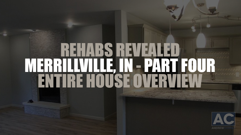
Rehabs Revealed: Merrillville Part 4 of 4 – Entire House Overview
December 16, 2014Week Four – Whole House Overview As soon as you step into the living room, the fireplace tile (from Home Depot) looks incredible! It’s no wonder this house went under contract so quickly! There were several “wow” factors — including the fireplace, an upgraded kitchen, a new master bathroom, a huge, new family room in the basement, and a great deck at the rear of the home, just off the dining room. Although we chose one of our popular color schemes for the inside, Rebecca and I chose a brand new color scheme for the outside. And, we will definitely use it again! When we find a color scheme that works, we like to use what works in other neighborhoods! This newly renovated home turned out great! Here are some of the SKU’s we used: Material list (Interior): Wall and Ceiling Color – Silver Sage (UL 210-8) Trim Color – Fledgling (MSL 198) Door Color – Elephant Skin (UL 260-5) Hardwoods – Donar Oak (LL – Special Order) Carpet – Touchdown Caramel (528-529) Interior Doors – Jeldwen Continental-Style (729-608) Living Room Light – 13″ Brushed Nickel 2-Light Flushmount Twin-Pack (701-704) Dining Room Chandelier – 3-Light Brushed Nickel (118-638) Baseboards – Pro-Pack of 7/16″x3″x12′ (143-210) Material list (Exterior): Base – Marble Quarry (PXO929) Trim – Whitedown (PXO916) Accent – Sea of Midnight (PXO995) Front Door – Raisin the Bar (PXO800) Door Handle – Kwikset (182-071) ...
read more5 Ways To Make Your House Stand Out – Part 2 of 2
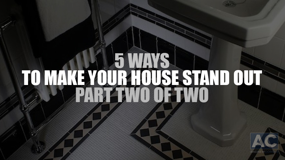
December 16, 2014Last week, we discussed number one (Be different than your competitors) and number two (How does the potential buyer perceive you?). This week, we’ll share with you number three through number five. I hope these five simple tips help you make the most out of your next real estate investment! #3. Tile is “art” not “flooring” Most investors consider tile or laminate floors simply as “flooring.” We’re different – we consider them to be a form of “art!” There are many things that I look forward to teaching at my events and this is one of them. In my investment area, other “flippers” are notoriously known for using the $.57, 12×12 beige tile that Home Depot sits over in the idle area by the pallets. I will never use that tile in my homes. Why? That’s simple: everyone else is using it and I want my investments to be different. I want the potential buyer to feel like they walked into a 5-star hotel and not $120,000 house! I can do that easily by using a specialty tile that doesn’t cost that much more than that basic beige 12×12. When you start to think of it as “art” rather than “flooring,” your potential buyers will begin to think the same way…and the end result will be more money in your pocket. I look forward to teaching you more about this at my next event in March! #4. The 3-color paint system Paint is fairly inexpensive yet your average “flipper” just keeps throwing that cheap beige paint on the walls and semi-gloss white paint on the trim and doors. You can’t get anymore “bland” than that! We use a 3-color paint system and receive more compliments on this one subject than almost anything else. One paint color is for the walls and ceilings, one for the trim, and one for the doors. Again, we steer-clear from the bright white trim because all of our competitors use that paint color and we want to be different! We want our houses to stand-out in a crowded market….and they do. This is why we end up getting above asking price in more than 90% of our closings. #5. The X-Factors In today’s housing market, almost every investor are attempting to use “wow factors:” granite counter-tops, stainless steel appliances or faucets, etc. We do this as well as it’s usually expected by potential buyers these days. But one thing we do differently is that we find a way to impress the potential buyers with something that they are never expecting. One of our favorite examples to use is installing “heated tiles” in the bathroom. We’ve been able to find this system at Home Depot for roughly $3-400! This one simple thing can work wonders for buyers who are on the brink of purchasing the home. And in the grand scale of things, wouldn’t a $3-400 dollar investment be worth it? Buyers in areas with cold winters love this option! There are many other “x-factors” that I plan on sharing with each of you in March. See you next week! ...
read moreDon’t Lose At The Kitchen Sink! (Video)
December 16, 2014This quick video gives an important tip for the kitchen. ...
read moreRehabs Revealed: Merrillville Part 3 of 4 – Bathrooms
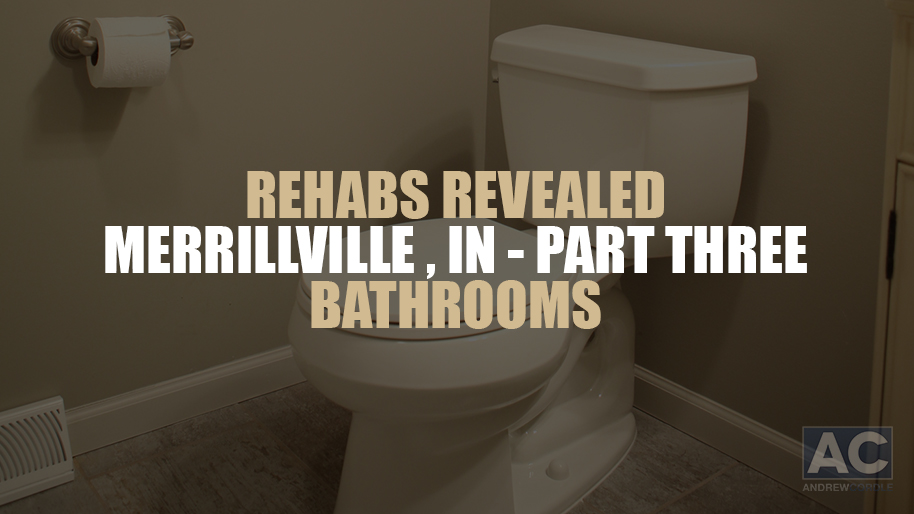
December 16, 2014Week Three – Bathrooms It’s great when our team comes up with a nice layout idea and when our contractor does a great job implementing it! That’s exactly what happened with the bathroom renovations on this property. We took a very ordinary 3 bedroom, 1 bathroom house, and were able to add a master bathroom, changing it to a 3 bedroom, 2 bathroom home. The glass accent tile Rebecca chose from Home Depot really dressed up the bathrooms in this house. Home Depot has several nice vanity options that included the tops for under $200. In addition to the master bath upgrade, we eliminated an unnecessary hallway area and exterior doorway to add a nice master bedroom closet with Martha Stewart shelving. All-in-all, the master suite turned out nicely! Material List – Hallway Bathroom: Floor Tile – 12″x12″ Nile Gray (1000-004-476) Floor Grout – Bone (123-852) Shower Tile – White Subway 3” x 6” (833-452) Accent – Keystone Interlock Glass (459-091) Shower Grout – Bone (123-851) Shower Faucet – Banbury 1-Handle Tub/Shower (243-261) Bathtub – 5′ Aloha White LH (478-640) Toilet – Dual Flush by Glacier Bay (215-583) Vanity – St. Paul Sea Bright 24” (1000-017-617) Faucet – Glacier Bay Buildiers 4″ 2-Handle (247-368) Mirror – 22″x28″ Brushed Nickel Frame (481-166) Lighting – Martha Stewart Living 3-light Skylands Collection (511-395) Towel Bar Set – Greenwich 3-piece Bath Accessory Kit in Satin Nickel (690-977) Material List – Master Bathroom Floor Tile – 6”x24″ Montagna Saddle (193-629) Floor Grout – Delorian Gray (656-844) Shower Tile – 13”x20” Broadmoor Platinum (1000-012-487) Accent – Arctic Storm (369-501) Shower Grout – Delorian Gray (999-482) Shower Faucet – Banbury 1-Handle Tub/Shower (243-261) Bathtub – 5′ Aloha White RH (481-143) Toilet – Dual Flush by Glacier Bay (215-583) Vanity – St. Paul Madeline 24” (628-505) Faucet – Glacier Bay Buildiers 4″ 2-Handle (247-368) Mirror – 22″x28″ Brushed Nickel Frame (481-166) Lighting – Martha Stewart Living 3-light Skylands Collection (511-395) Towel Bar Set – Greenwich 3-piece Bath Accessory Kit in Satin Nickel (690-977) ...
read more5 Ways To Make Your House Stand Out – Part 1 of 2
December 16, 2014What sets us apart from our competition? Most real estate investors would never share their secrets with the public…but we’re different! We want to share our wealth of knowledge to help make you more successful and profitable when it comes to your real estate investment(s). Over the next two weeks, I’ll be sharing with you “Five Ways to Make Your House Stand Out.” This week, we’ll address number one and number two from our list: #1. Be different from your competitors: Over the last twelve months, our company has flipped close to one hundred homes in the Chicago-area. Over 90% of those flips received “above ARV” offers! In today’s market, that’s rare. I’m sure you’re wondering “how” we were able to do that. The primary reason is because we rehabilitate our “flips” much differently than our competitors by providing the buyer what they want rather than giving ourselves what we want. Every buyer has an mental picture and checklist of exactly the type of house that they want. Most of those ideas come from a TV show, something they saw on the internet, or an idea they found in a magazine article. However, one of the biggest downfalls of investors is ignoring what a potential buyer wants and offer them the cliche “beige paint, white trim, beige interior paint, beige tile, brown carpet, beige tile, and brown cabinets.” Ask yourself: how many times have you watched those popular design shows on cable and saw celebrity real estate investors using the same-old “beige-everything” approach? I’d be willing to bet you could, at best, count them all on one-hand. It’s not rocket science! Make your investment stand-out by giving the potential buyer what they want instead of what you want or is the least expensive. It needs to look like a custom designed home rather than a home designed by a contractor or narrow-minded investor! #2. How does the potential buyer perceive you? Most real estate investors are perceived as just that…”investors.” Their houses look like average investor projects and the investor talks like every other investor talks. Consequently, they’re receiving low-ball offers and usually struggle to get an offer that’s even remotely close to full asking price. In our general investment area, we’re known as “Ann Lee Interiors,” which is a custom home design company. Our buyers perceive us as custom home designers rather than flippers/investors wanting to earn a quick buck and move onto the next investment without putting any thought or pride into their flip. Our buyers see our homes as ones that they are eager and excited to purchase rather than a house that they are just “agreeing” to buy. This is how we increase our market perception in our investment areas. So again, ask yourself this: “How does my potential customer perceive me? Do they perceive me as a ‘flipper’ or as a ‘custom home designer’?” Next week, we’ll list number three through number five. Have a strong week! ...
read more


